ChildObesity180 Dashboard

.png)
Context
The ChildObesity180 Dashboard project was completed as my senior capstone project with a group of four other peers. The project was completed over the course of a semester (Feb-May, 2021).
Team: Amber Chong, Dylan Daisey, Arely Mancia, Alec Portelli
Task
Create a digital platform for the community leaders who work with ChildObesity180. The platform should enable users to view data and connect with/learn from other leaders across the country with similar pursuits.
Background
Our sponsor for this project was Tufts professor, Christina Economos, the co-founder and director of ChildObesity180. ChildObesity180 is a non-profit organization that aims to "improve the health of all children through innovative research, multi-sector partnerships, and stakeholder networks."
Methods
-
Project notebook/website
-
Stakeholder discussions
-
Competitive analysis
-
Questionnaire
-
User Interviews
-
Journey map
-
Site mapping
-
Wireframing
-
Usability testing
-
Prototyping
Process
Roadmap
Competitive Analysis & Background Research
Questionnaire
Ideation
Prototype Development
Initial Wireframes + User Feedback
Usability Testing
Competitive Analysis & Background Research
Our work with ChildObesity180 involved stepping into an ongoing project with pre-existing research. Consequently, our process for this project began with conducting thorough reviews of these research efforts. The primary materials that we reviewed were recorded interviews with stakeholders and a landscape assessment of existing obesity and health dashboards. The interviews helped us to understand the users’ wants and needs for the dashboard we intended to design. We used the landscape assessment, as well as our own competitive analysis of existing health dashboards, to hone our design goals; we aimed to build off of what other dashboards did well and improve upon what they did not do well. Overlap in the insights gained from our background research revealed several features and qualities that we would consider implementing in our design. Some of these features/qualities were: data customizability (e.g., different variables, broad to granular), information about policy effectiveness, and a public facing interface that also allows for more advanced analysis.
Questionnaire
Our next step was to develop a questionnaire aimed at further understanding the users of the dashboard and their needs. We were specifically concerned with determining the aspects of a dashboard that would be most important to respondents, and we were also interested in their data needs. Unfortunately, due to IRB issues, we weren't able to send out this survey until much later in the project timeline. However, the survey results still served as a useful deliverable to our sponsor.
Ideation
Taking the information we gained from our background research, we utilized Miro (an online collaborative whiteboard platform) to organize our ideas. We created a site map to display our initial concept for the layout of the site. We also created a persona and journey map to help us empathize with the users.


Initial Wireframes + User Interviews

The next step in our process was to design preliminary wireframes for the dashboard. These initial wireframes were low fidelity and were intended to portray our early ideas from which we could get feedback and improve upon. To get feedback on our initial wireframes, we conducted interviews with various coalition leaders. These interviews involved informal user testing and general questioning aimed at gaining feedback on our designs. Some of the questions we asked were:
"What do you think is the purpose of this page?”, “What would you click if you wanted to…?”, and “Based on everything you’ve seen, why might you want to have an account for this dashboard?”
The biggest takeaway from these interviews was that we learned participants really valued being able to see what other initiatives were going on across the country to combat child obesity. They wanted to be able to make connections with the leaders of these efforts and replicate initiatives that have been successful in other places.
Prototype Development
Based on the feedback for our wireframes and further brainstorming, we created a higher fidelity final prototype of the dashboard. Our final design included four main features:
Hub: A feed featuring news articles and community updates
Data: A UI tool where users can view and compare different variables
Network: A directory where users can search for, filter, and connect with other members
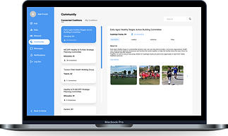
Community: A centralized collection of all partnered coalitions and their initiatives

Usability Testing
After creating our final prototype, we conducted formal usability tests. Although our project timeline ended before we were able to implement the feedback from these tests, these usability tests were helpful to determine future directions if we were to continue to develop the design.
Method
With the help of our sponsor, we recruited six coalition leaders from various cities and four ChildhoodObesity team members, for a total of 10 participants. Each test lasted 30 minutes. All of these sessions were conducted through zoom and were recorded with permission for note-taking purposes. We shared our prototype beforehand and asked participants to share their screen while they interacted with it. Some of our participants were returning participants from our first round of interviews.
We instructed users to conduct various tasks with the screen mockups we developed. The mockups had basic functionality such as scrolling and clicking to navigate to a page, but not all elements were interactive. We had participants speak their thought processes aloud while they conducted these various tasks so we could understand what they were thinking. After we finished going through the prototype, we asked general, interview-style questions to the participants about what they thought of the design and any ideas they had for improvement. We had one moderator, who followed our pre-written script, and one notetaker for each session.
Research Goals
-
Determine if our design contains all the information/features that the users need
-
Determine if the information architecture of our prototype is intuitive to users such that they can successfully navigate through various aspects of our dashboard to find information that they are looking for
-
Discover users' pain points, frustrations, and barriers to success when using the prototype and discuss how they would improve it
Results
Overall we received a good combination of validating positive feedback and suggestions for improvement. Participants were happy with the overall layout of the design and the features that are included. They successfully and seamlessly completed our tasks.
Some examples for changes we could make based on the feedback we were given were: include information about grants/funding opportunities on the "Hub" page and provide more detailed information about the areas of other coalitions so that the user could see if their community was similar to the one they were looking at.
Impact
Our final prototype served as useful material for a proposal presentation by ChildObesity180 to receive further funding for the development of this dashboard.
Reflection
The biggest challenge of this project was to boil down the broad vision of our sponsor into a scope that was realistic for us to accomplish in one semester and that aligned with the strengths of our group. Initial meetings with our sponsor included discussions of data collection and visualization on a topic we were unfamiliar with (child obesity). We wanted to contribute to our sponsor's vision, but we had to focus on the things we could accomplish given our skillsets and timeframe. Consequently, we decided to spend our efforts on creating the overall layout of the dashboard and making sure it included everything that users would want, organized in a clear and usable way (instead of focusing on specific data sources and data visualizations). While this rescoping was certainly a challenge, it also taught me the importance of determining scope before diving into a project. When a scope is loose or undefined, project work can become messy, disorganized, or even purposeless.